In the dynamic landscape of branding, fonts and colours play a pivotal role in shaping a brand’s identity and perception. Let’s take a closer look at two UK-based brands that have effectively leveraged fonts and colours to establish iconic brand identities.
1. Virgin Atlantic
Fonts: Virgin Atlantic, the renowned airline founded by Sir Richard Branson, is recognised for its sleek and modern brand identity. The company utilises a custom font known as “Virgin Atlantic Bold,” which is distinctive yet easily recognisable. This font exudes confidence and professionalism, perfectly aligning with the brand’s ethos of innovation and excellence.
Colors: Virgin Atlantic’s colour palette is dominated by a striking shade of deep red known as “Virgin Red.” This bold colour choice not only captures attention but also symbolises energy, passion, and dynamism—qualities synonymous with the Virgin brand. Complemented by shades of white and metallic silver, the colour scheme exudes sophistication and style.
Impact: By consistently applying its custom font and vibrant colour palette across various touchpoints, Virgin Atlantic has created a visually cohesive brand identity that stands out in the competitive airline industry. The combination of modern typography and bold colours reflects the airline’s commitment to delivering a premium and memorable travel experience.
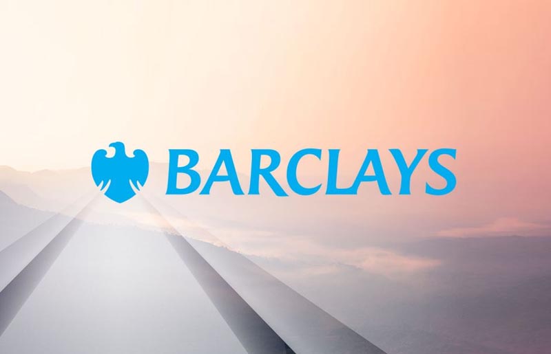
2. Barclays
Fonts: Barclays, one of the UK’s leading financial institutions, has a brand identity characterised by clarity and professionalism. The company’s use of the “Barclays New” font reinforces its commitment to transparency and trustworthiness. This sans-serif font is clean, legible, and modern, making it ideal for communicating complex financial information effectively.
Colours: Barclays’ colour palette features a dominant shade of blue known as “Barclays Blue.” This timeless colour conveys stability, reliability, and authority—attributes that are crucial in the financial sector. Paired with accents of white and silver, the colour scheme exudes a sense of confidence and integrity, reinforcing Barclays’ position as a trusted financial partner.
Impact: By employing a clear and modern font alongside a classic blue color palette, Barclays has established a strong and recognisable brand identity that resonates with customers. The consistent use of these elements across its branding materials instils confidence and reassurance, positioning Barclays as a reputable and dependable financial institution.
Conclusion
These examples highlight how fonts and colours can be powerful tools for building iconic brand identities. Virgin Atlantic and Barclays have successfully utilised these elements to communicate their values, differentiate themselves in their respective industries, and connect with their target audiences effectively. By understanding the impact of fonts and colours on brand perception, businesses can create memorable and compelling brand identities that leave a lasting impression.